Multimedia Design Made Simple
This article illustrates some of the planning that is needed for a smooth workflow in producing an effective multimedia program. A simple program like the one used for this example does not necessarily need the level of design and documentation shown, but whenever possible it is always a good idea to have a solid blueprint before embarking on the development of a topic that requires multimedia and programming to avoid ambiguity. In general, the deeper the topic the more design detail it needs.
Before moving forward with designing the program it is important to have a topic solidly defined, as well as an audience for which the end-product is intended. For this simple example we will describe the product as follows:
Description:
This multimedia program is intended to teach the identification and spelling of three fruits to preschool aged children. This program is intended to operate within a web browser using a computer mouse. The three fruits featured in this program are an apple, banana, and peach. Optional features for this program include spoken words that pronounce the name of the fruit, and animated spelling that builds each letter of a fruit word, one at a time, when the word is clicked.
Design Documents:
Design documents are extremely useful for clarifying how a program's content may be graphicaly arranged and how elements within the interface might be interactive, or connected to other elements within the program. A design document is not necessarily intended to show the final layout and features of a program, but can be though of as a kind of springboard that leads to an effective, and hopefully engaging, final product with input from members of a development team. Even if the development team consists only of you, having a well thought out design document will shorten the production cycle of the program. Additionally, design documents provide an easy to understand format for showing clients what they might expect from the program before it has been produced. In the early design phase changes can be easily made and signed off by the client. All of this is to say that it is a worthwhile effort on many fronts.
Content Layout:
The images below represent a potential layout for the program.
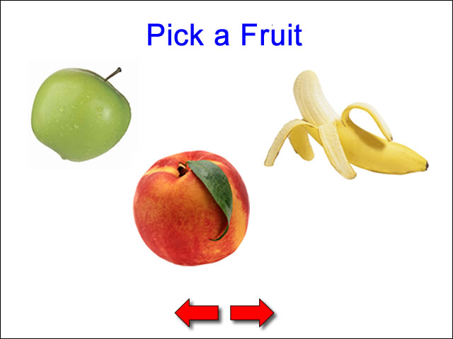
The above image represents the main screen of the program. When a piece of fruit is clicked the fruit is featured, along with its spelling. Navigation arrows allow navigation forward or backward through the content.

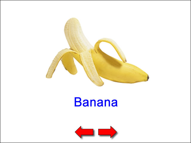
The image above represents the potential layout and screen elements that are a part of each fruit's screen. Animated rollover effects, and possibly sound effects may make the content more appealing for the intended young audience. For fun, the fruit could be eaten away a bite at a time, each time it is clicked. When the fruit disappears enirely it could reappear with an animated effect.

Navigation Map:
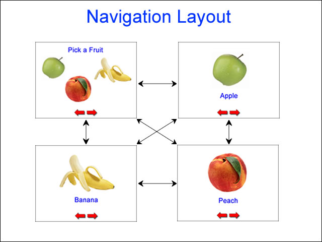
A design document should include a navigation map, or some kind of clear description of which screen elements connect to other screen elements. The overall navigation map for the program is show below. It generally shows how content screens are connected. Double-ended arrows indicate the user may go to or from a particular screen from another screen. This kind of synoptic map does not show which specific screen elements handle the navigation.
Navigation Elements:
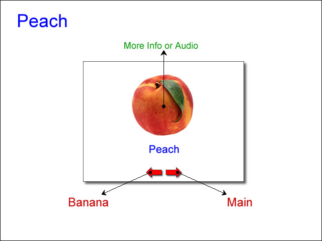
Specific navigation elements for each content screen of the program are shown below.

The small black arrows indicate which content screen will appear when a specific screen element is clicked.

The "More info or Audio" link is colored green to differentiate it from pure navigation. It allows the concept to be expanded, if needed, while maintaining clarity for the core navigation elements. This leaves the option to make the content more interesting, if time, budget, and resources allow.

The extensive use of screen comps and illustrative descriptions makes it very easy to see what the program is comprised of, what media assets may be needed for its production, and how its media elements are connected. All of this information can be described verbally, but images can go a long way toward helping a client, or members of a production or development team, understand the scope and depth of an interactive multimedia program.
Other Possibilities:
It is never a bad idea to include alternative designs or intended audiences. For example, this program could be easily expanded to include other fruits or foods for each letter of the alphabet. Here is an example layout for how this might look:
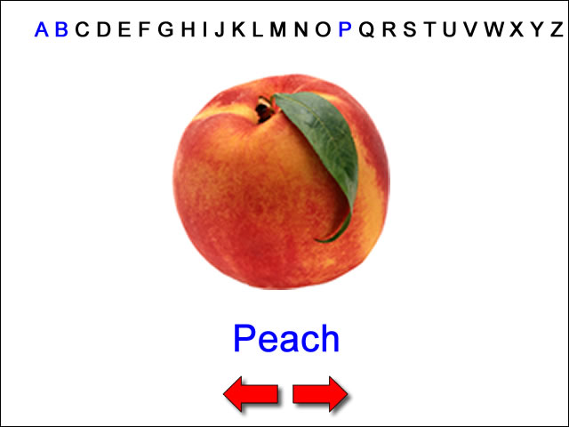
The letters across the screen would be clickable elements that would navigate to other fruits or foods, and have the same kind of features and layout as shown in the above screen.
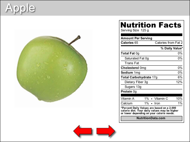
If the intended audience of the program was redefined, some of the elements of the children's version of the program might remain, but additional details or features would likely need to be implemented. For example, adults might be more interested in the nutritional content of fruits and foods. This might change the potential layout to something like this:
The Design Process:
When producing media of any kind, it is important to always spend the time to establish a plan. Production plans are almost always changed because of unknown or unanticipated factors, but having an easy to understand design document will go a long way toward streamlining the timeline, resources, and overall cost of developing an idea. Designers should be comfortable with the iterative create process that accompanies prodution work. In the earliest stages of developing a concept or idea, nothing should be dismissed as an option. If a design document is part of a proposal, it is often a good idea to include a basic (i.e., cheaper) and ideal (i.e., more expensive) plan. Once the plans are laid out the client or sponsors of the effort can decide how much the idea is worth, and provide funding accordingly.
